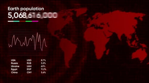
Global Data Interface with Animated World Map and Population Statistics
By BaldasaridstockOne great value subscription from €14.50/month
- Unlimited downloads of 27+ million creative assets
- AI Tools: video, image and more
- Lifetime commercial license
- Easy cancellation
Already have an account? Sign in
Attributes
- Length
- 0:15
- Resolution
- 3840 x 2160
- File Size
- 616 MB
- Frame Rate
- 25 fps
- Alpha Channel
- No
- Looped
- No
- Video Encoding
- ProRes
- Orientation
- Horizontal
- Commercial License
- Further Information
Description
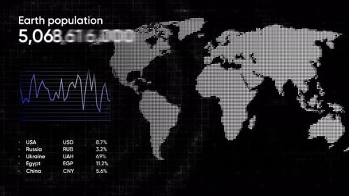
The animation features a dynamic digital interface presenting global data. A world map made of illuminated red dots serves as the background, while real-time "Earth population" numbers rapidly update at the top left. Below this, a fluctuating line graph visualizes trends. To the bottom left, a table displays financial percentages for various countries like USA, Russia, Ukraine, Egypt, and China. As the animation progresses, glowing lines connect from a central point (representing USA data) to other highlighted countries on the map, displaying their respective population figures in circular data widgets. The overall aesthetic is futuristic and clean, utilizing a limited color palette of red, white, and subtle neon accents against a dark, grid-patterned background. This animated interface is ideal for corporate presentations, news broadcasts, or any project requiring a sophisticated visualization of global statistics and interconnected data flows.