Futuristic Financial Data Visualization with Downward Trend Arrow
By bangjeyOne great value subscription from €14.50/month
- Unlimited downloads of 27+ million creative assets
- AI Tools: video, image and more
- Lifetime commercial license
- Easy cancellation
Already have an account? Sign in
Attributes
- Length
- 0:20
- Resolution
- 3840 x 2160
- File Size
- 975 MB
- Frame Rate
- 24 fps
- Alpha Channel
- No
- Looped
- No
- Video Encoding
- ProRes
- Orientation
- Horizontal
- Commercial License
- Further Information
Description
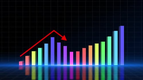
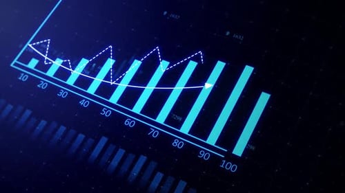
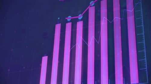
This animated clip presents a sophisticated data visualization interface, ideal for high-tech financial analysis or corporate storytelling. A series of vibrant pink bar charts emerge against a deep blue, grid-based background, accompanied by a dynamic line graph that tracks upward progress. As the sequence develops, a large, prominent pink arrow appears, slashing diagonally across the frame to indicate a significant downward trend or market crash. The visual aesthetic is clean and futuristic, featuring subtle UI elements like axis scales and digital textures that enhance the professional feel. The pacing is steady, allowing viewers to absorb the shift from growth to decline, making it a powerful tool for projects discussing economic volatility, stock market fluctuations, or technological data monitoring. This infographic style effectively transforms complex information into a compelling visual narrative, elevating the production value of news broadcasts, business presentations, or analytical documentaries focusing on global finance and digital innovation.