One great value subscription from €14.50/month
- Unlimited downloads of 27+ million creative assets
- AI Tools: video, image and more
- Lifetime commercial license
- Easy cancellation
Already have an account? Sign in
Attributes
- File Types
- GLTF, BLEND
- File Size
- 4.14 MB
- Textures Included
- Yes
- Rigged
- No
- Animated
- No
- Polycount
- 184 polygons
- Commercial License
- Further Information
- Part of Pack
- 3D Infographics Element Icon Vol 2
(20 items)
Description
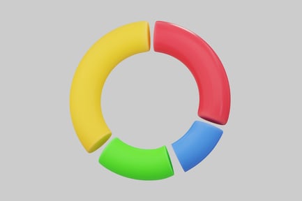
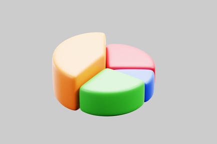
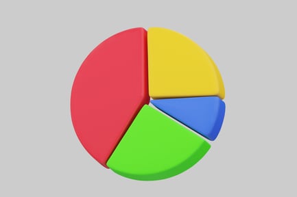
Pie chart is a circular diagram that is divided into sections, each of which represents a percentage of the total. the sections are typically colored to make them easy to distinguish, and the chart is often used to compare different data sets. in this image, the pie chart is divided into four sections, each of which represents a different percentage of the total. the sections are colored red, yellow, blue, and green, respectively. the chart is a clear and organized visual representation of data, and the