YouTube Channel Presentation On All Devices 2D Motion Graphics Animation 4K
By mahirhadizadeOne great value subscription from €14.50/month
- Unlimited downloads of 27+ million creative assets
- AI Tools: video, image and more
- Lifetime commercial license
- Easy cancellation
Already have an account? Sign in
Attributes
- Length
- 0:09
- Resolution
- 3840 x 2160
- File Size
- 55.4 MB
- Frame Rate
- 25 fps
- Alpha Channel
- No
- Looped
- No
- Video Encoding
- ProRes
- Orientation
- Horizontal
- Commercial License
- Further Information
Description
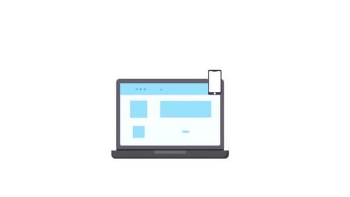
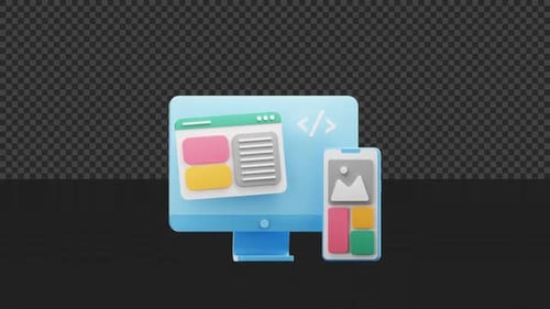
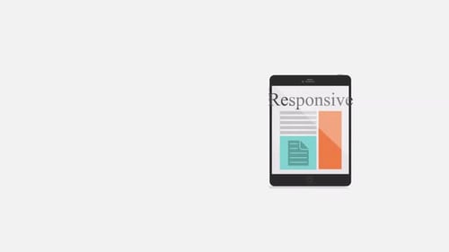
This animated illustration depicts the concept of responsive web design across multiple digital devices. A desktop monitor, tablet, and smartphone appear in a clean, minimalist line art style, with each screen dynamically displaying a website interface and a video player. Subtle animations highlight the adaptive nature of content presentation on different screen sizes. This modern and sleek visual asset is ideal for technology-focused presentations, explainer videos, or digital marketing materials illustrating multi-platform compatibility and user experience design.