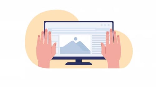
Animated Responsive Website Design on Multiple Screens
By TheImgOne great value subscription from €14.50/month
- Unlimited downloads of 27+ million creative assets
- AI Tools: video, image and more
- Lifetime commercial license
- Easy cancellation
Already have an account? Sign in
Attributes
- Length
- 0:07
- Resolution
- 3840 x 2160
- File Size
- 348 MB
- Frame Rate
- 30 fps
- Alpha Channel
- Yes
- Looped
- No
- Video Encoding
- ProRes
- Orientation
- Horizontal
- Commercial License
- Further Information
Description
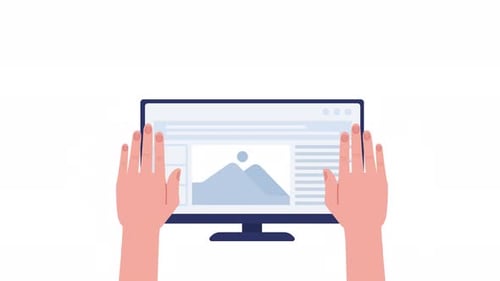
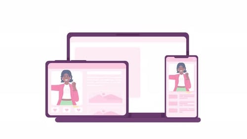
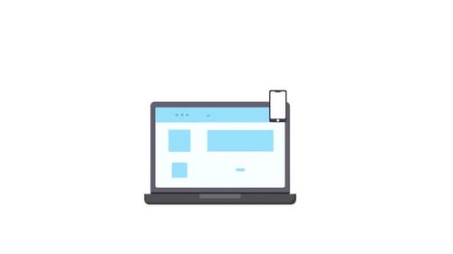
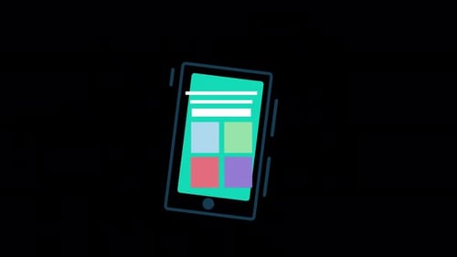
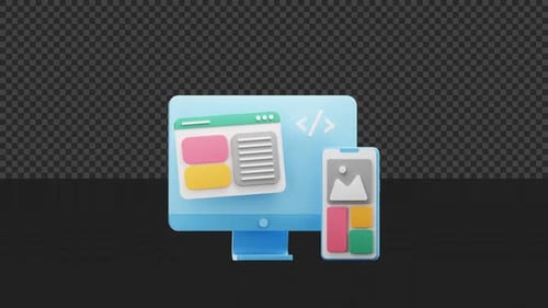
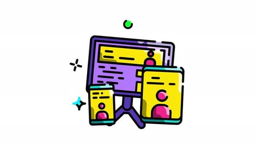
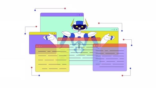
This animated clip showcases responsive web design across various digital devices. The illustration begins with a website displayed on a desktop monitor, smoothly transitioning to a tablet, and finally to a smartphone. As the screen size changes, the webpage layout dynamically adapts, demonstrating optimal user experience across different orientations and dimensions. The clean, 2D flat design style uses solid colors and simple vector shapes to create a modern and clear visual narrative. Hands briefly appear, interacting with the devices as they transform, emphasizing user interaction. This animation is ideal for presentations, explainers, or educational content related to web development, UI/UX, digital marketing, or showcasing technological adaptability. Its crisp visuals and fluid motion effectively convey the importance of responsive design in today's multi-device environment.