Responsive Web Design Display on Desktop and Laptop Animation
By TheImgOne great value subscription from €14.50/month
- Unlimited downloads of 27+ million creative assets
- AI Tools: video, image and more
- Lifetime commercial license
- Easy cancellation
Already have an account? Sign in
Attributes
- Length
- 0:06
- Resolution
- 3840 x 2160
- File Size
- 114 MB
- Frame Rate
- 30 fps
- Alpha Channel
- Yes
- Looped
- Yes
- Video Encoding
- ProRes
- Orientation
- Horizontal
- Commercial License
- Further Information
Description
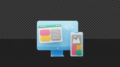
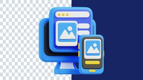
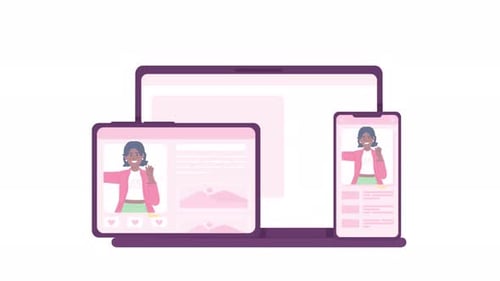
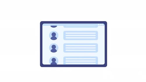
This animated clip presents a dynamic illustration of responsive web design, seamlessly transitioning between a desktop monitor and a laptop setup. The visual utilizes a clean, modern flat design aesthetic characterized by bold blue accents, precise black outlines, and a crisp white background, creating a professional and engaging look. A striking diagonal wipe serves as the core transition element, effectively demonstrating the fluid shift of content display from one device to another. This versatile visual effect is ideal for enhancing tech-focused presentations, enriching digital marketing campaigns, or serving as an impactful explainer video element. It effectively illustrates cross-device compatibility, user interface (UI) principles, and user experience (UX) concepts, making complex ideas easily digestible. The animation is designed to integrate smoothly into various projects, featuring an alpha channel for effortless compositing over different backgrounds, allowing creators to highlight the adaptive nature of digital content across multiple platforms.